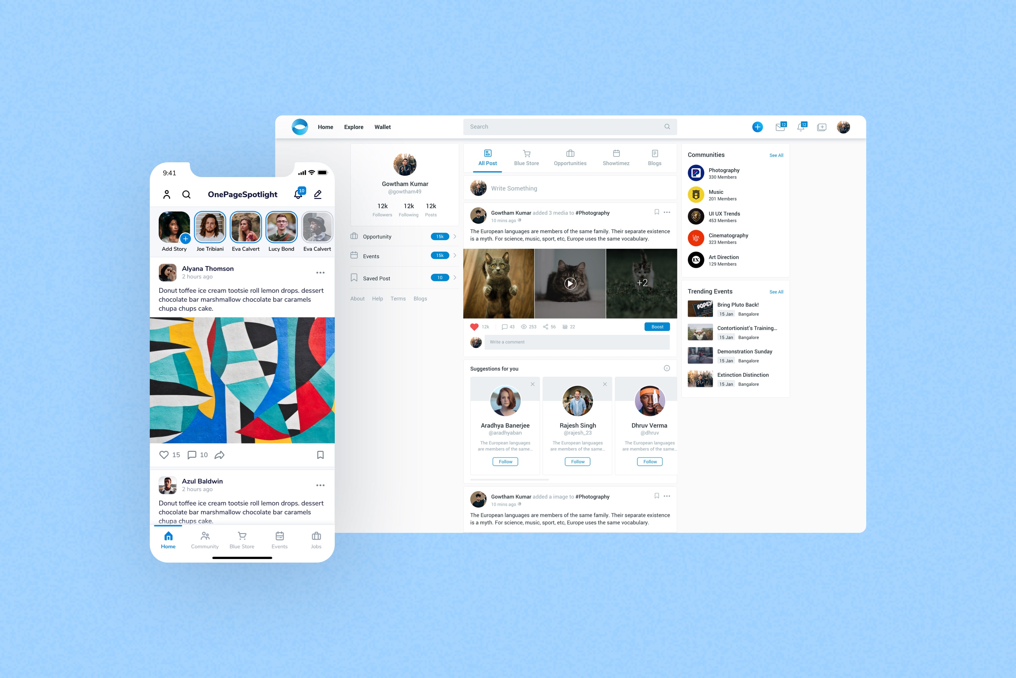
360° ANALYSIS
We surveyed a number of competitor's websites and mobile applications. In this analysis, we focused
on the website's overall branding, functionality, content, site architecture and design. This
informed of opportunities we could implement a platform. Shared the results with stakeholders who
are responsible for scoping and plan subsequent user research.
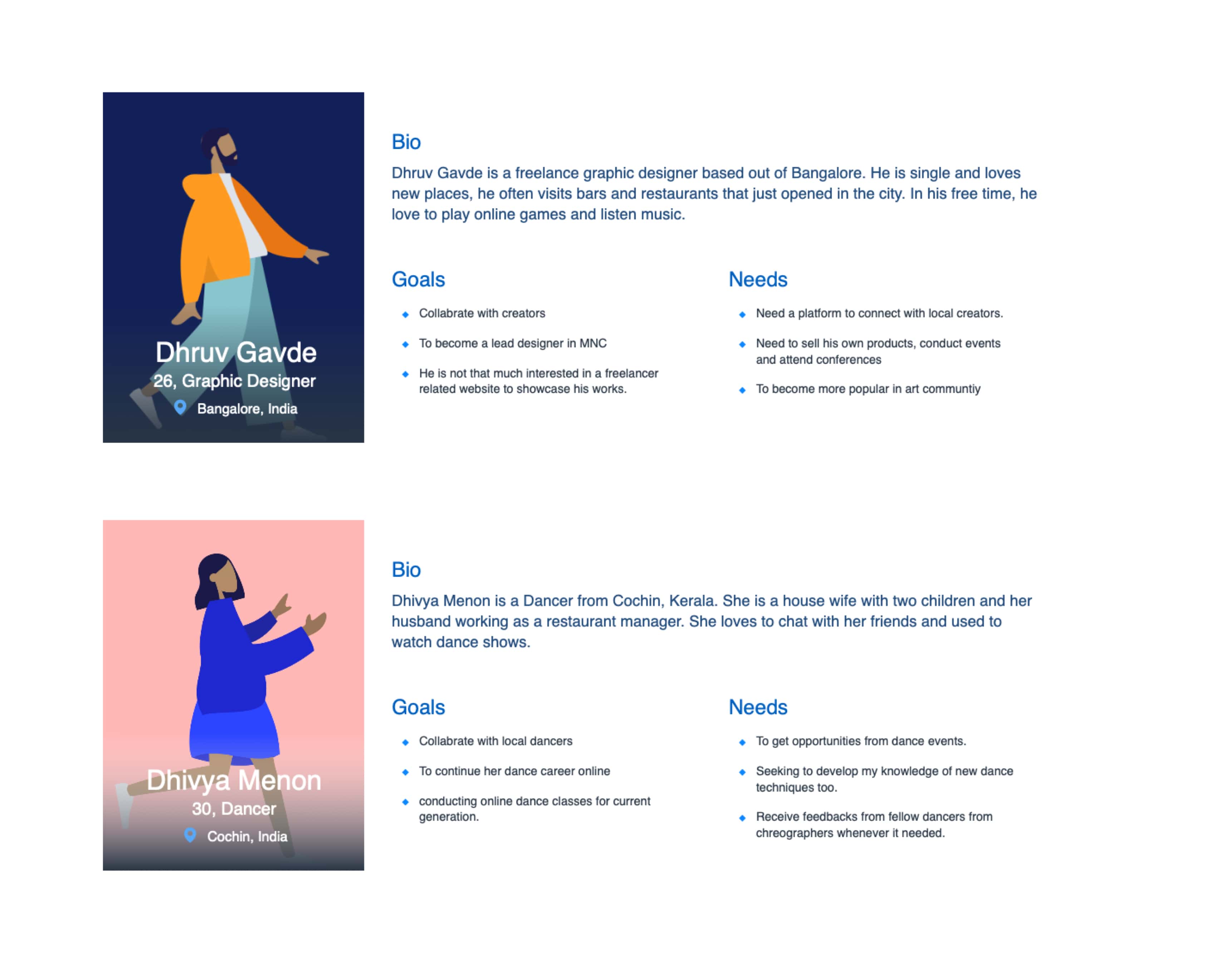
USER PERSONAS
It was important that product would address and acknowledge the needs across a wide spectrum of
Creators and organisations. My team and I were able to narrow down the users into general category
of creators that we felt would be most inclined to visiting and using the product and created three
accompanying user personas.
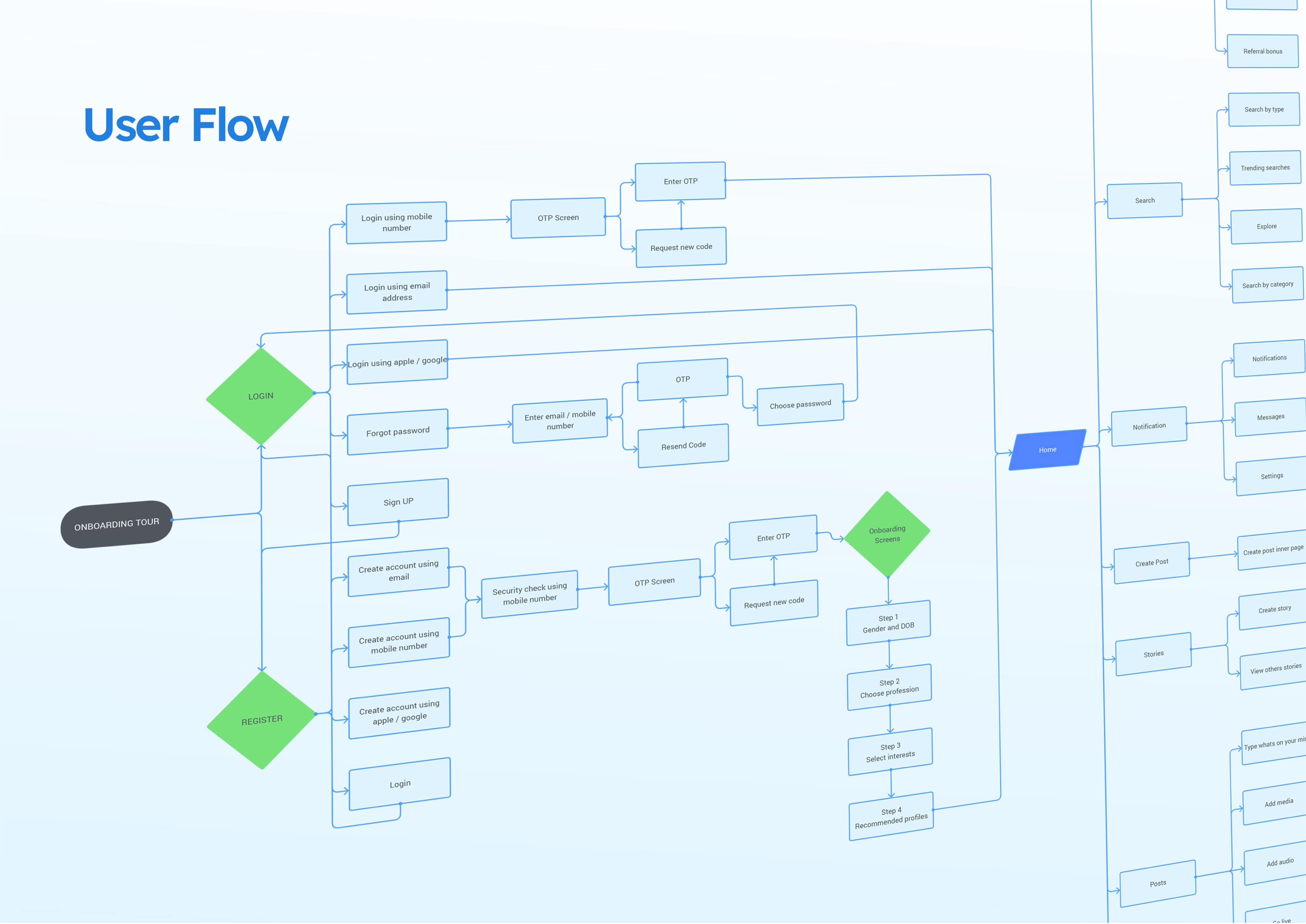
USER FLOW
We summarized the process in a user flow and then outlined my recommended ideal process.
IDEATION + ITERATION
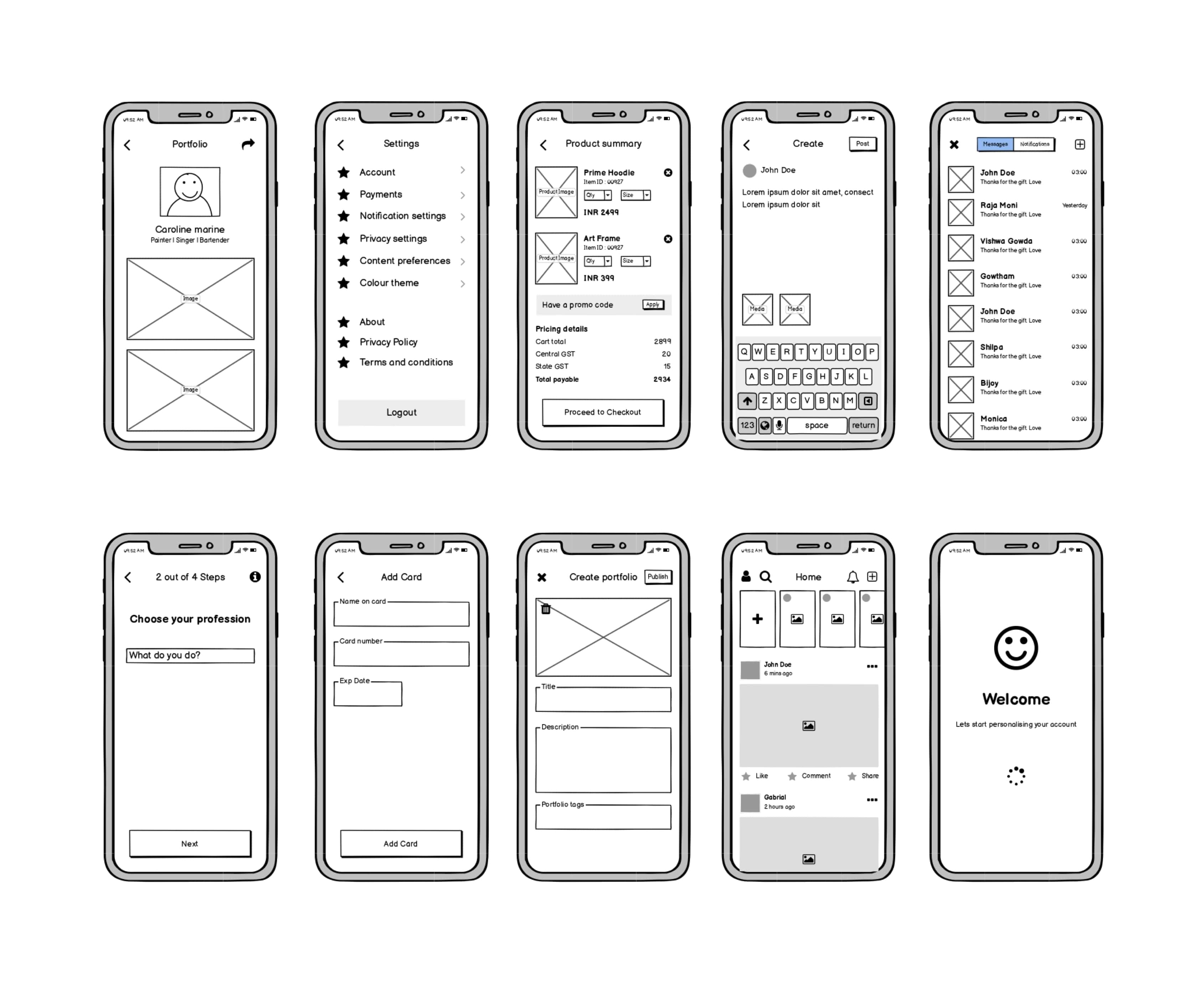
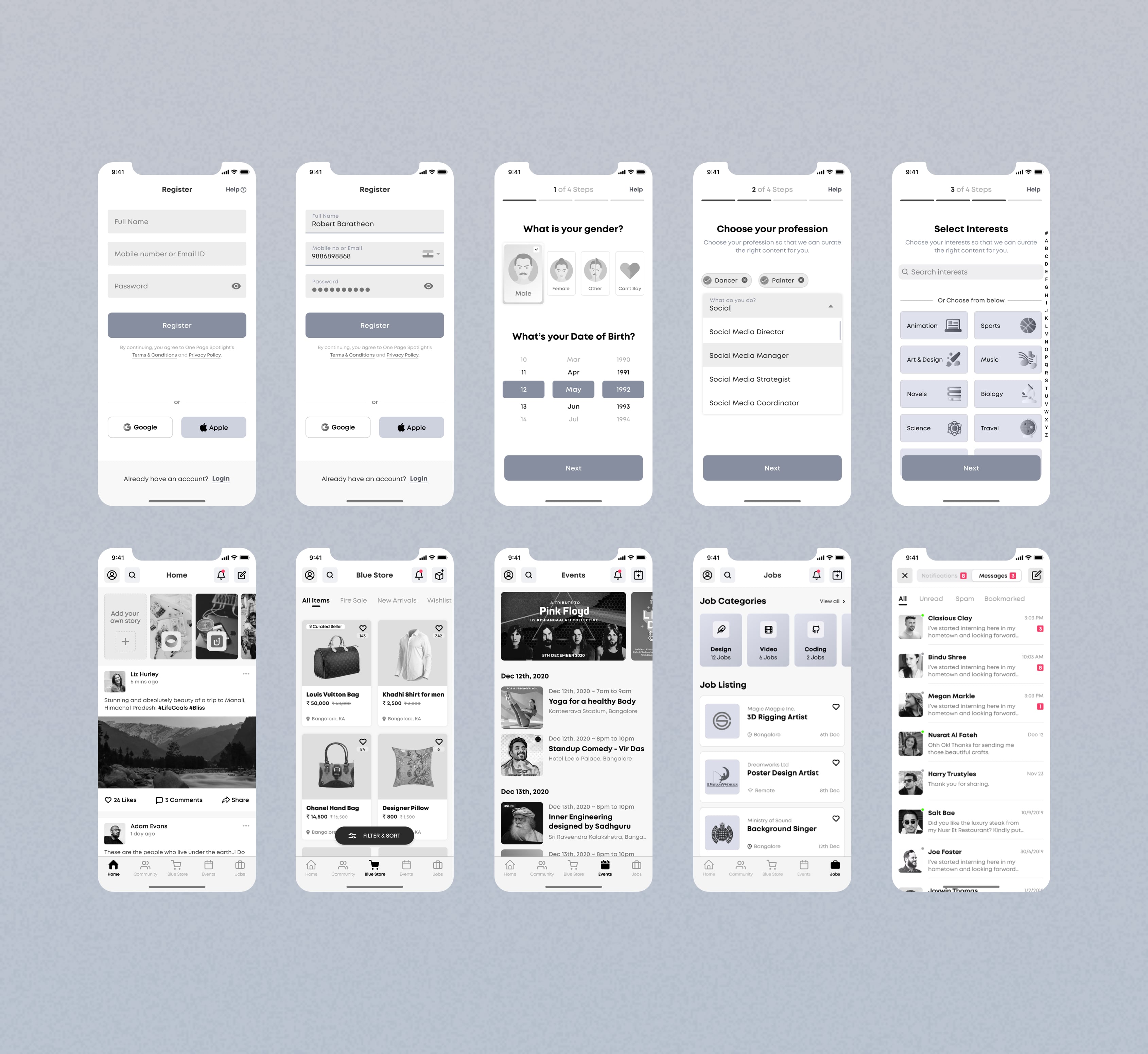
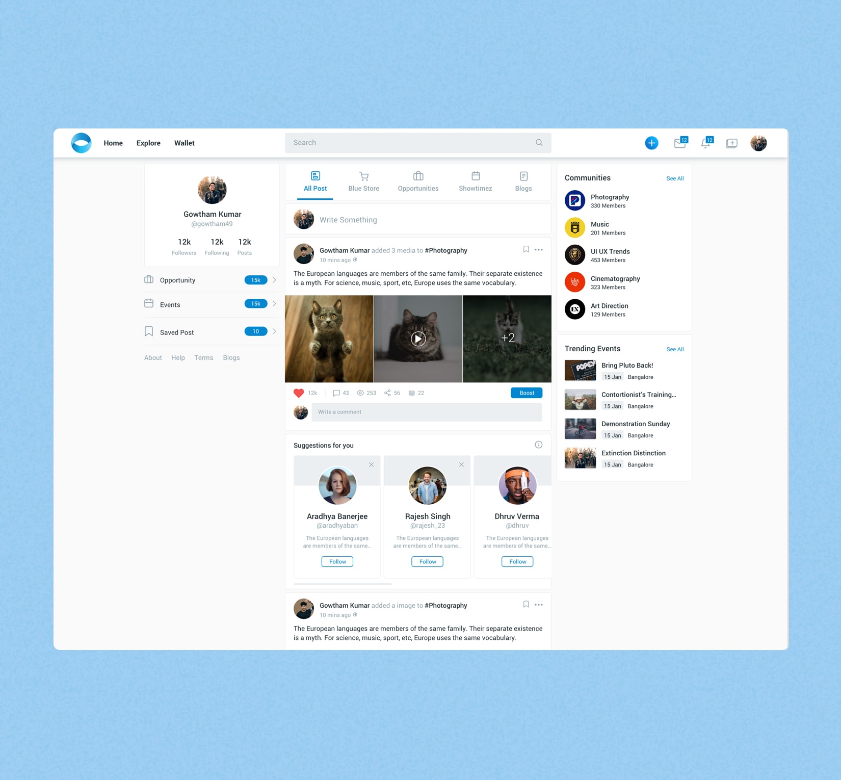
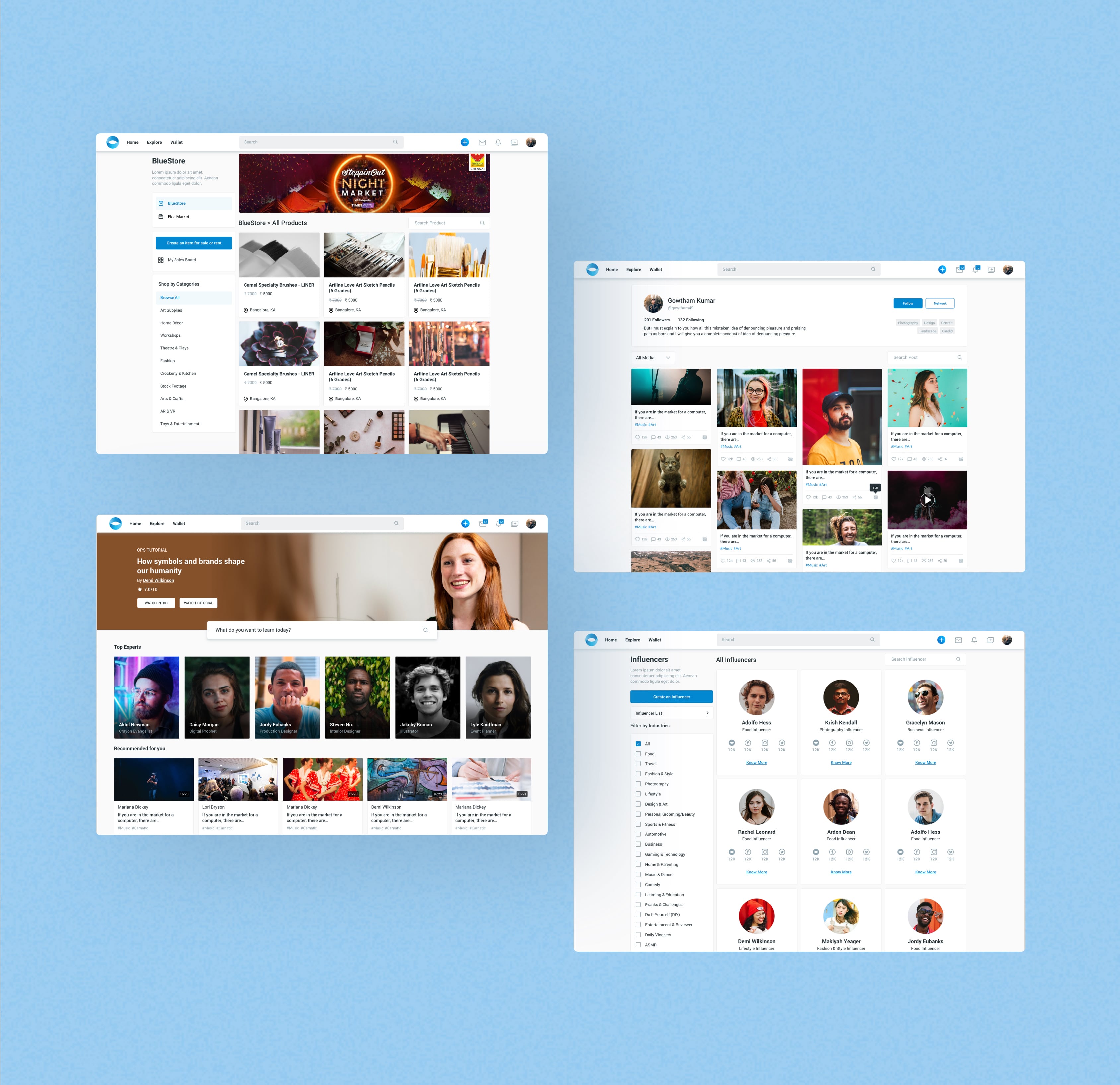
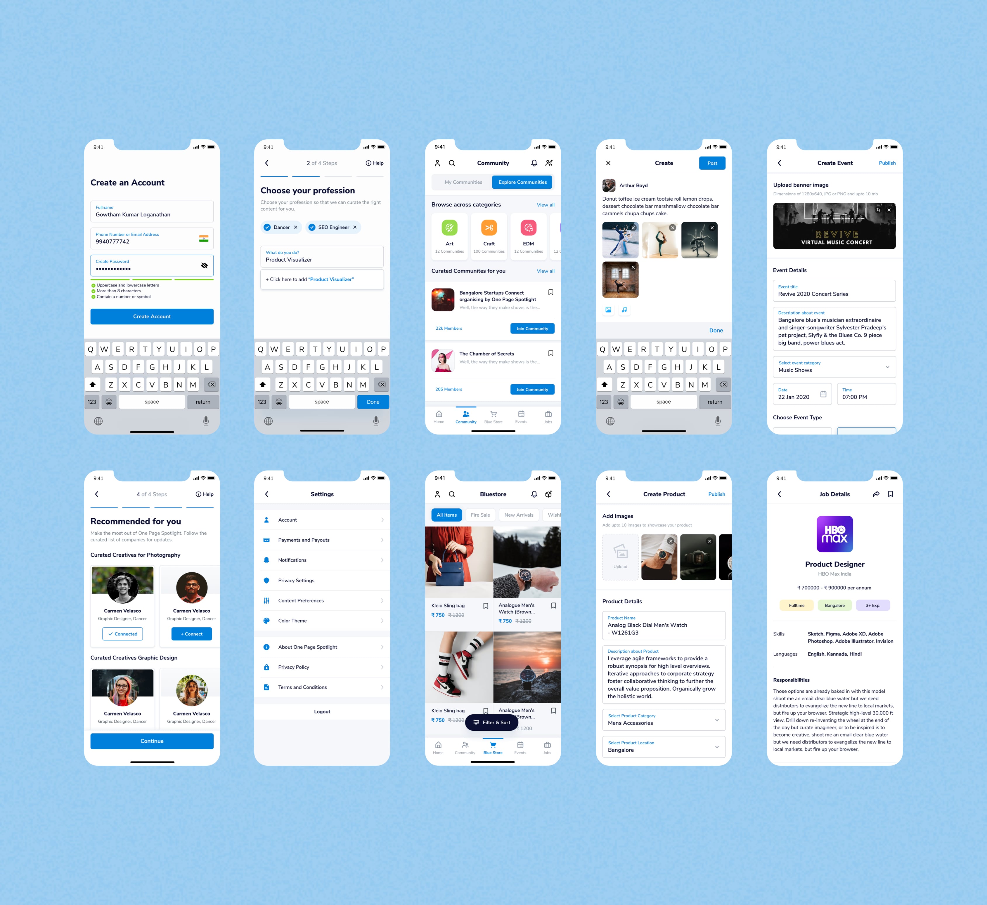
Our low fidelity prototype allowed my team and I to consider the optimal layout for the end user. It
was especially important to us that the overall layout and navigation through the product would be
straightforward despite the large amount of content that stakeholders requested that we include.
